
You're spending money driving traffic to your website. Google Ads are running. Your SEO is pulling in clicks. Maybe you're paying for social ads too. But your landing page converts at 1.5%. That means for every 100 people who visit, 98 leave without calling, filling out a form, or doing anything at all.
That's not a traffic problem. That's a landing page problem.
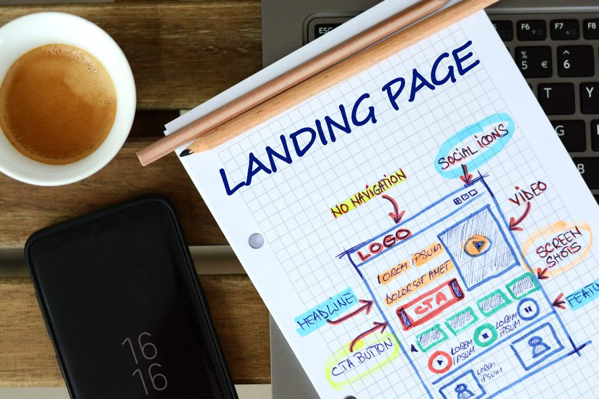
A landing page is a focused page built to get one specific action from one specific audience. It's not your homepage. It's not your services page. It's a page designed to convert, and most of them don't do that job well enough.
After 16+ years of building and auditing landing pages for businesses across Denver and Colorado, we've seen the same mistakes show up again and again. The good news is that most of them are fixable, often with changes you can make this week. These landing page best practices are based on what we've seen work in real digital marketing campaigns, not theory from a software company trying to sell you a page builder.
With AI-powered search now pulling landing page advice directly into results, the bar for what ranks and what converts keeps going up. This guide covers what actually matters, and what most businesses get wrong.
Key Takeaways
- Match your message to the click. Your landing page headline must mirror the ad or search query that brought visitors there. Mismatched messaging is the #1 conversion killer.
- Lead with what matters most. Everything a visitor needs to act (headline, value proposition, and CTA) should be visible before they scroll.
- Remove exit points. Site navigation, sidebar links, and social icons on landing pages cost you conversions. Every extra link is an invitation to leave.
- Service businesses play by different rules. They need longer landing pages with more trust signals than SaaS or e-commerce companies. "Keep it short" doesn't apply to high-consideration services.
- Fewer form fields, more conversions. Every additional field reduces your conversion rate. Ask only for what you need to start the conversation.
- The median is 6.6%. That's the median landing page conversion rate across all industries (Unbounce, Q4 2024). If yours is well below that, the problem is almost always fixable.
01 - The ProblemWhy Most Landing Pages Underperform
The median landing page conversion rate across all industries is 6.6%, based on Unbounce's Q4 2024 analysis of 41,000 landing pages and 464 million visitors. That's the median. Plenty of pages convert at 2-3%, and the top performers hit 10% or higher.
The gap between "having a landing page" and "having one that works" is where most businesses lose money. And the losses add up fast. If you're spending $3,000 a month on Google Ads at $10 per click, you're getting 300 visitors. At a 2% conversion rate, that's 6 leads. Improve to 6%, and that's 18 leads from the same spend. Understanding landing page best practices is the difference between those two outcomes.
Same budget. Three times the results. That's what conversion rate optimization actually looks like in dollar terms.
Data Point
At $10 per click and a 2% conversion rate, each lead costs $500. Improve to 6%, and that drops to $167. Same ad budget, three times the leads.
After auditing hundreds of landing pages, the problems tend to fall into the same categories: the page doesn't match what the ad promised, there are too many distractions, the page loads too slowly, the CTA is weak or buried, or there's nothing on the page that builds trust. Let's fix each one.
What we see most often in landing page audits:
- The headline doesn't match the ad or search query that brought the visitor there
- The page has too many exit points (navigation, social links, footer menus)
- No social proof near the call to action
- The page takes over 3 seconds to load on mobile
- The form asks for more information than needed at this stage
- The CTA button says "Submit" instead of something specific
If any of those sound familiar, you're not alone. These are the same problems we fix for clients every month.
02 - Message MatchMatch Your Message to Your Traffic Source
This is the most common landing page mistake we see, and it's the one that costs the most money.
When someone clicks a Google Ad for "emergency plumber Denver" and lands on a generic services page that talks about remodeling, new construction, and commercial plumbing, they bounce. The landing page headline needs to mirror the ad copy or search query that brought them there.
This applies to every traffic source. If your email campaign promotes a free consultation, the landing page better lead with that free consultation, not your company history. If your Facebook ad shows a specific product, the landing page should feature that product front and center.
We audited a Denver law firm's paid search campaigns last year and found their Google Ads promised "free case evaluation" while the landing page said "schedule a paid consultation." They were burning over $4,000 a month on clicks that had almost no chance of converting. The fix took 20 minutes. The results showed up within days.
The rule is simple: whatever promise got the click, the landing page needs to deliver on that promise immediately.
03 - Above the FoldPut Your Most Important Elements Above the Fold
"Above the fold" means everything a visitor sees before scrolling. On a desktop, that's roughly the top 600 pixels. On mobile, it's even less.
Your headline, your core value proposition, and your primary call to action all need to be visible here. A visitor should know within 3 seconds what you offer, who it's for, and what to do next.
This doesn't mean cramming everything above the fold. White space is your friend. But the most important elements, the ones that determine whether someone stays or leaves, need to be visible from the moment the page loads.
Use visual cues to guide the eye. A bold, distinct button color for your CTA. An arrow pointing toward the form. A hero image that shows your product or service in action rather than a generic stock photo. These details sound small, but they compound. A clear visual hierarchy can be the difference between a 2% and a 6% conversion rate.
04 - DistractionsRemove Distractions (Yes, Even Your Navigation)
A landing page has one job: get the visitor to take one action. Your main site navigation, footer links, sidebar widgets, social media icons, all of these give visitors a way to leave without converting.
In a well-known VWO case study, removing navigation from a landing page increased signups by 100%. That's not a small improvement. It's the kind of result that shows how much exit points cost you.
Reality Check
"But what if visitors want to learn about our company?" Fair concern. The answer isn't keeping your full nav bar. It's putting the trust elements they need (testimonials, credentials, years in business) directly on the landing page itself.
The exception is longer-form landing pages for high-consideration services. A simplified anchor navigation within the page, like the table of contents at the top of this article, can help visitors find what they need without leaving.
05 - CopyWrite Copy That Speaks to One Person With One Problem
Most landing page copy talks about the company. It should talk about the customer's problem.
Lead with the benefit, not the feature. "Cut your energy bill by 30% this winter" works better than "energy-efficient HVAC installation services." The first one tells the visitor what they get. The second tells them what you do. Visitors care about what they get.
Be specific. Vague headlines like "quality service you can trust" convert poorly because they could describe any business in any industry. Specific headlines like "same-day furnace repair, licensed, insured, serving Highlands Ranch since 2012" convert well because they answer real questions: How fast? Are they legit? Do they work in my area?
Write like your customer talks. Pull language from your Google reviews, from support calls, from the questions people ask when they email you. If your customers say "my AC is broken," don't write "HVAC system remediation solutions." Match their language and you'll match their intent.
One page, one audience, one problem. If you serve homeowners and commercial property managers, build separate landing pages. The messaging that convinces a homeowner to call is different from what convinces a facilities director.
07 - FormsSimplify Your Forms (Every Field Costs You Conversions)
Every form field you add creates friction. Name, email, and phone number is often the maximum you need for a first touchpoint. Asking for company size, annual revenue, and "how did you hear about us" on an initial contact form is a fast way to kill conversions.
Data Point
According to HubSpot, the majority of high-performing forms use 3-5 fields. Omnisend found that 3 fields hit the sweet spot, with an average conversion rate of 10%.
The question to ask yourself: what's the minimum information you need to start a conversation? You can qualify leads later. The form's job is to start the relationship, not complete the sale.
For service businesses, "name, email, phone" or "name, email, brief description of what you need" works well. Save the detailed intake for the follow-up call.
One more thing: your submit button text matters. "Submit" is generic and tells the visitor nothing about what happens next. "Get My Free Quote," "Schedule My Consultation," or "Send My Audit Request" tells them exactly what they're getting.
08 - Page SpeedSpeed Kills (Slow Load Times, Anyway)
Portent's research found that pages loading in 1 second convert at roughly 3x the rate of pages that take 5 seconds. Conversion rates drop fast as load time climbs. If your landing page takes 4-5 seconds to load, you're losing visitors before they even see your headline.
Google measures page performance through Core Web Vitals. Here's what to aim for:
- LCP (Largest Contentful Paint): Under 2.5 seconds. This is how long it takes for the main content to appear.
- INP (Interaction to Next Paint): Under 200 milliseconds. This measures how quickly the page responds when someone clicks or taps.
- CLS (Cumulative Layout Shift): Under 0.1. This measures whether elements jump around while the page loads.
Quick wins that make a real difference: compress your images (most landing page images are 3-5x larger than they need to be), minimize JavaScript, use a content delivery network (CDN), and lazy-load any images below the fold.
Test your page speed for free at Google PageSpeed Insights. If your score is below 70 on mobile, you have work to do.
09 - Service BusinessesLanding Pages for Service Businesses Are Different
This is where most landing page guides get it wrong. They're written by SaaS companies for SaaS companies. They assume high traffic volumes, simple products, and one-click purchases. The landing page best practices that work for a software trial signup don't apply to a roofing estimate request.
If you run a service business, a law firm, an HVAC company, a dental practice, a marketing agency, a construction company, the rules are different.
Higher consideration means more trust-building. Nobody hires a lawyer or a contractor after reading one headline. Your landing page needs to do more work before asking for the conversion. That means real testimonials, credentials, years of experience, and proof that you've solved this problem before.
Local trust signals matter. A local phone number (not a 1-800 number). Your physical address. Photos of your actual team, not stock photos of smiling people in headsets. If you serve specific neighborhoods or cities, mention them. For Colorado businesses, this also means having your Google Business Profile fully optimized because that's where most people check your reviews before they ever visit your landing page.
The CTA is a conversation, not a purchase. "Schedule a free consultation" or "get a free estimate" works differently than "buy now." You're asking someone to start a relationship. The landing page needs to reduce the perceived risk of reaching out. Phrases like "no obligation," "takes 5 minutes," and "we'll call you back within an hour" lower the barrier.
Reality Check
Every generic guide says "keep your landing page short." For service businesses with average project values over $1,000, we've tested this. Longer pages with detailed case studies, pricing transparency, and multiple forms of social proof consistently outperform short pages.
A plumber with a $150 service call might convert fine with a short page. A financial advisor asking someone to trust them with their retirement savings probably won't. Test both and let the data decide, but don't default to short just because a SaaS blog told you to.
10 - MetricsWhat to Measure (And What "Good" Looks Like)
You can't improve what you don't measure. Here are the metrics that matter for landing pages, along with benchmarks to compare yourself against.
| Metric | Poor | Average | Good | Excellent |
|---|---|---|---|---|
| Conversion Rate | Under 2% | 3-5% | 6-8% | 10%+ |
| Bounce Rate | Over 80% | 60-70% | 45-55% | Under 40% |
| Page Load Time | Over 4s | 2.5-4s | 1.5-2.5s | Under 1.5s |
| Avg. Time on Page | Under 30s | 30-60s | 1-2 min | Over 2 min |
Conversion rate depends on what you're asking. A free ebook download will always convert higher than a $10,000 service inquiry. Compare yourself against similar offers, not against unrelated benchmarks.
Bounce rate over 70% usually means a message mismatch. Visitors expected one thing, found another, and left. Go back to the "match your message" section above.
For service businesses, longer time on page is usually a good sign. It means visitors are reading, evaluating, and building trust before they convert. Short time on page with low conversions means your content isn't compelling enough to hold attention.
Cost per conversion is the number that matters most. If your Google Ads spend $10 per click and your page converts at 2%, each lead costs $500. Improve to 6%, and that drops to $167. That's the math that should drive every landing page decision.
If your numbers look weak, your landing page is probably showing signs that it isn't converting, and the fix is usually simpler than you think.
11 - MistakesCommon Landing Page Mistakes We See Again and Again
After auditing hundreds of landing pages, these are the problems that show up most often.
Using your homepage as your ad landing page. Your homepage serves multiple audiences with multiple messages. That's the opposite of what a landing page should do. Every paid campaign needs its own focused page.
Unclickable phone numbers on mobile. Over 80% of landing page traffic comes from mobile devices. If your phone number isn't a clickable tap-to-call link, you're losing calls from the people most ready to convert.
Headlines about your company instead of the customer's problem. "Denver's Premier HVAC Company Since 1995" is about you. "Furnace broken? We'll fix it today." is about them.
A "Submit" button. Nobody is excited to "submit." Replace it with copy that tells visitors what they're getting: "Get My Free Quote," "Book My Appointment," "Send My Audit Request."
Stock photos of handshakes and conference rooms. These signal "generic business" and erode trust. Use real photos of your team, your work, your location. If you need help with creative assets, that's a solvable problem. Real photos convert better than stock photos every single time.
Social media links on the landing page. You're sending visitors to Instagram. They're not coming back. Remove every link that doesn't serve the conversion goal.
Forms that ask for too much. If your form has more than 5 fields, you're probably asking questions you don't need answers to right now. Simplify.
12 - DIY vs. AgencyWhen to Optimize Yourself vs. When to Call In Help
Not every business needs to hire an agency to fix their landing pages. Here's an honest breakdown.
DIY makes sense when:
- You have a simple lead magnet page (ebook download, newsletter signup)
- Your traffic is low (under 500 visits a month), you won't have enough data for meaningful testing
- You have one product or service and one target audience
- The changes are straightforward (updating headlines, shortening a form, compressing images)
Expert help makes sense when:
- You're running paid ads with significant monthly spend, because every percentage point of conversion improvement saves real money
- You serve multiple audiences or offer multiple services that each need their own landing page strategy
- You're in a competitive local market where everyone is bidding on the same keywords
- You've been optimizing on your own and the numbers haven't moved
- Your landing pages are part of a larger conversion rate optimization strategy that includes SEO, content, and paid media working together
The math is straightforward. If you're spending $5,000 a month on ads and your landing page converts at 2%, you're generating about 20 leads at $250 each. A professional who knows landing page best practices and can move you to 5% gives you 50 leads at $100 each, an extra 30 leads per month from the same budget.
FAQFrequently Asked Questions About Landing Page Best Practices
At minimum, one for each major service or campaign. HubSpot's research found that companies with 30 or more landing pages generate 7x more leads than those with fewer than 10. Each audience segment, each offer, and each ad group should ideally point to its own page. More pages means more targeted messaging, which means higher conversion rates.
The median across all industries is 6.6% (Unbounce, Q4 2024). But "good" depends on context. A free ebook download should convert at 15-20%. A lead form for a $10,000 service might convert at 3-5% and still be performing well. Compare yourself against similar offers and industries, not generic benchmarks.
Tools like Unbounce, Leadpages, and Instapage work fine for simple campaigns. For service businesses that need deeper trust-building, custom pages integrated with your website often perform better because they feel like part of your brand rather than a disconnected microsite. The best approach depends on your traffic volume, budget, and how complex your offer is.
It depends on what you're selling. Low-commitment offers (free downloads, newsletter signups) work with short pages. High-commitment services (legal consultation, major home repairs, marketing retainers) often need longer pages with testimonials, case studies, and detailed information. Test both and let the data decide.
Conversion rate improvements can show up within days if you have enough traffic. SEO-related improvements like better rankings and increased organic traffic take 4-8 weeks. The fastest wins usually come from fixing message match issues and simplifying forms, those tend to produce measurable results almost immediately.
You need one page that works well on both desktop and mobile. Responsive design is the standard. But test on actual devices. A page that looks great on desktop can be unusable on a phone if buttons are too small, forms are awkward to fill out, or text requires pinch-zooming. With over 80% of landing page traffic coming from mobile, getting this right is not optional.
Get Your Free Landing Page Audit
We'll review your message match, page speed, form friction, and trust signals. You'll walk away knowing exactly what to fix and in what order.
Request Your Free AuditBased in Denver, working with businesses across Colorado and the U.S.
David Drewitz
Founder of Creative Options Marketing, a Denver-based agency specializing in SEO, landing page optimization, and conversion strategy since 2009. 16+ years helping Colorado businesses build measurable search visibility. Connect on LinkedIn.
06 - Social ProofUse Social Proof That Actually Builds Trust
A testimonial that says "Great company!" from "John D." does almost nothing. Social proof works when it's specific, verifiable, and placed where it matters.
What works:
What doesn't work:
Placement matters as much as content. Social proof placed directly above or beside your CTA form reduces friction at the exact moment someone is deciding whether to fill it out. A Denver HVAC company we worked with added three Google review excerpts directly above their contact form. Their form completions increased by over 40% in the first month.