

Good billboard design starts with a clear offer. At Glen Rose Medical Center, the revision added words: the early concept carried four; the final carried ten, excluding the logo. The added headline named MRI.
In February 2025, the client and I agreed that the photograph was difficult to decipher. I directed a revision that kept the image and made the service explicit. The before-and-after artwork shows the tradeoff: a longer read in exchange for naming what the picture left unclear.
That message still needed a layout for each booked board. Creative Options Marketing's Roadside Decision Check separates those decisions: what viewers understand and whether the file fits the display. The nine rules and original examples below show what to keep, what to reconsider, and what to verify before approval.
Start with the intended audience and finish this sentence: “After seeing the board, I want people to remember ____.” A hospital-awareness campaign and an MRI campaign may use the same photograph but need different headlines. The offer, advertiser, and intended takeaway should survive a brief look.
The OAAA 2021 creative guide recommends seven words or fewer as a benchmark; Lamar's design guidance also recommends seven or fewer. Use that discipline to cut repetition, while protecting the words that explain the offer. A short message that requires viewers to guess the service has missed the point.
The case for fewer words is strong: they leave more attention for the image, brand, and takeaway. OAAA also recognizes the power of a purely visual ad. That works as a creative approach when the image explains the offer. Glen Rose exposes the limitation: an ambiguous scanner photograph needed the service name. The 2021 guide supplies craft benchmarks here, not current performance evidence.
OAAA recommends developing the concept before choosing its placement. That protects the idea from premature constraints. Final approval requires the reverse check: does this idea work on the actual face? Its crop, type size, and production file need checking at each destination.
Track A checks the message. Track B checks the booked unit. Some rules connect both because viewing conditions affect what people can read.
The Glen Rose revision moved the service name into the dominant headline. The photograph stayed; the words took on the job of identifying MRI.
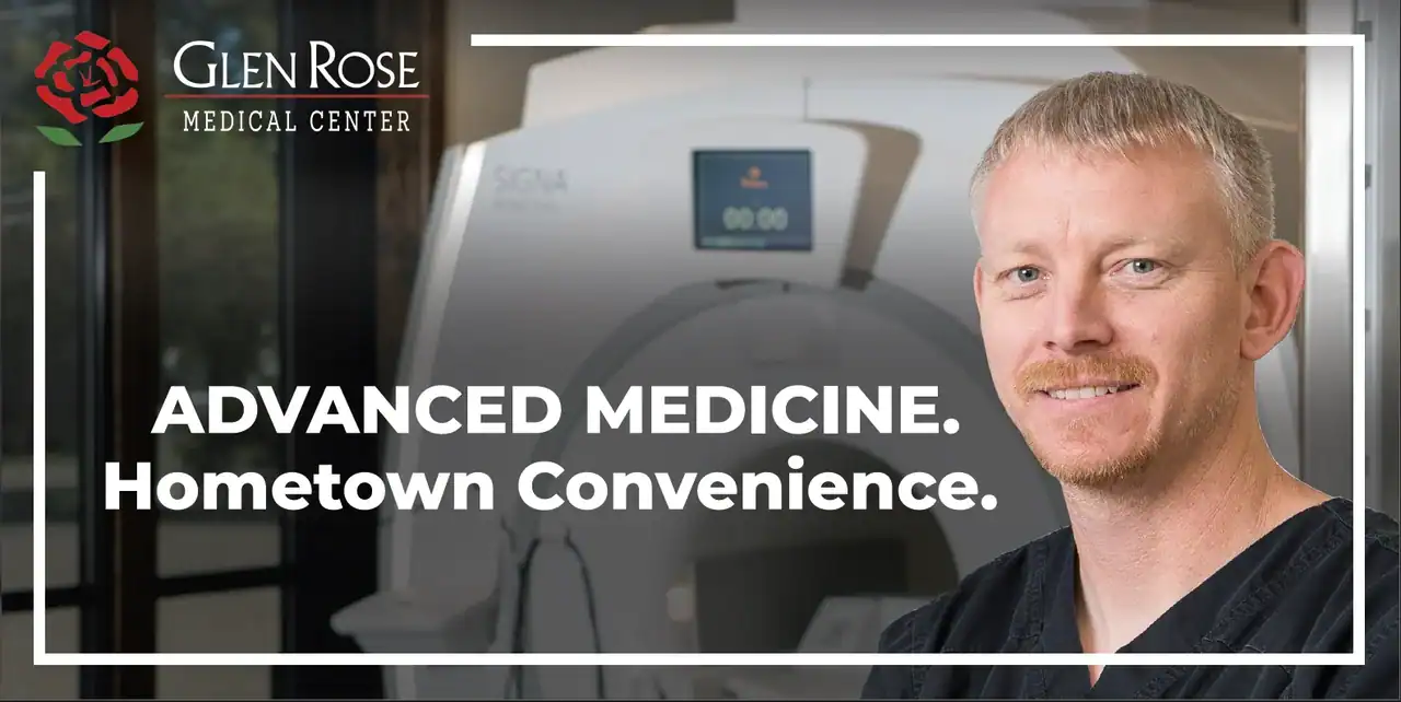
On February 17, 2025, after discussing the image with the client, I instructed the designer to retain the photograph and revise the headlines to make the MRI subject clear. The final 12 × 24 artwork supplied on February 24 uses this headline:
Advanced MRI Technology With Enhanced Comfort
The broader hospital promise becomes supporting copy beneath it.

| Design decision | Early concept | Final 12 × 24 artwork | Practical lesson |
|---|---|---|---|
| Main message | Broad hospital promise | MRI named in the dominant headline | Name the service when the image alone is ambiguous |
| Photograph | Person with clinical equipment | Photograph retained | Solve the specific problem before replacing the whole idea |
| Hospital promise | Main headline | Smaller supporting line | Reorder the hierarchy when the communication objective changes |
The six-word MRI headline sits above the four-word hospital promise: ten words excluding the logo, compared with four before. “Advanced” appears twice. Naming the service added reading load and left a repetition worth questioning. A possible next test would remove that adjective from the supporting line while retaining MRI in the headline. That test has not been run.
For Creative Options Marketing, the lesson is simple: name the service before optimizing the word count. The artwork establishes what changed. The correspondence establishes why it changed and that final files reached the vendor. Neither establishes driver comprehension, patient inquiries, or campaign lift.
Glen Rose’s two final files show why an approved message still needs layout work. The 12 × 24 face is 2:1; the 10 × 30 face is 3:1. The wider version puts the hospital promise on one line instead of two, with different punctuation and a different crop.

| Feature | Final 12 × 24 | Final 10 × 30 |
|---|---|---|
| Face ratio | 2:1 | 3:1 |
| Main MRI headline | Six words, two lines | Same six words, two lines |
| Hospital promise | Two lines | One line |
| Promise punctuation | No periods | Periods after both phrases |
| Logo and photograph | Larger relative logo; taller crop | Smaller relative logo; wider crop |
At the same height, a 3:1 frame has 50% more width than a 2:1 frame. Enlarge a 2:1 design proportionally to fill that width and one-third of its height falls outside the frame. Stretch it horizontally instead and the contents distort. These are calculated alternatives, not claims about how the designer produced the Glen Rose finals.
Compare the source and target ratios before approving an adaptation. A difference requires a layout review; a match still leaves bleed, safe area, resolution, and the message to check. Approving one size cannot settle the other.
This is why media planning belongs beside the creative brief. The list of booked faces determines which adaptations must be scoped.
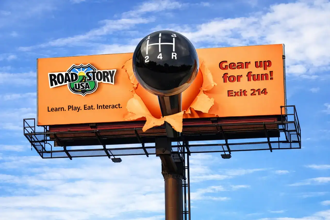
Roadstory concept B shows why an action line and a destination description deserve separate decisions: one asks the driver to leave the highway; the other explains the place. I developed the original Roadstory USA concepts in 2008, before Creative Options Marketing was founded. The images below are later AI-assisted recreations used to illustrate those concepts, not original production files or installation photographs.
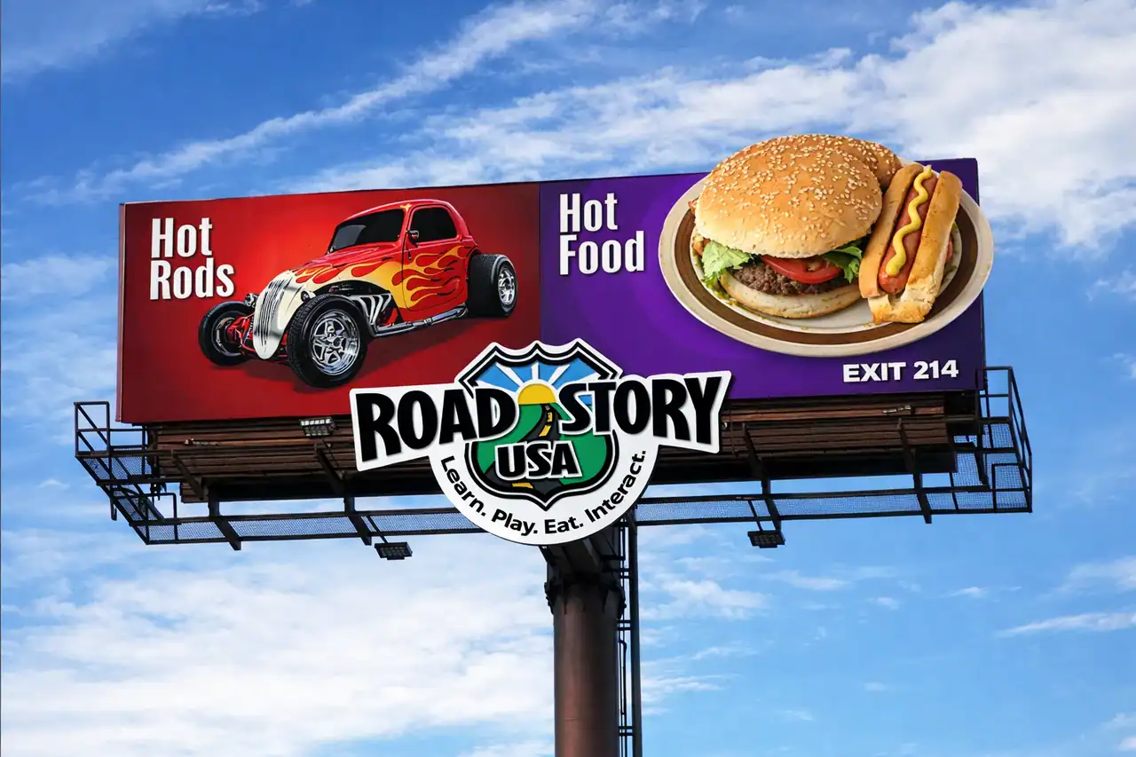
Concept A shows a car and food. The logo lockup adds “Learn. Play. Eat. Interact.” Count those words too. The unresolved question is whether the brand and Exit 214 connect the attractions to one destination. Another slogan would add reading load without necessarily answering it.
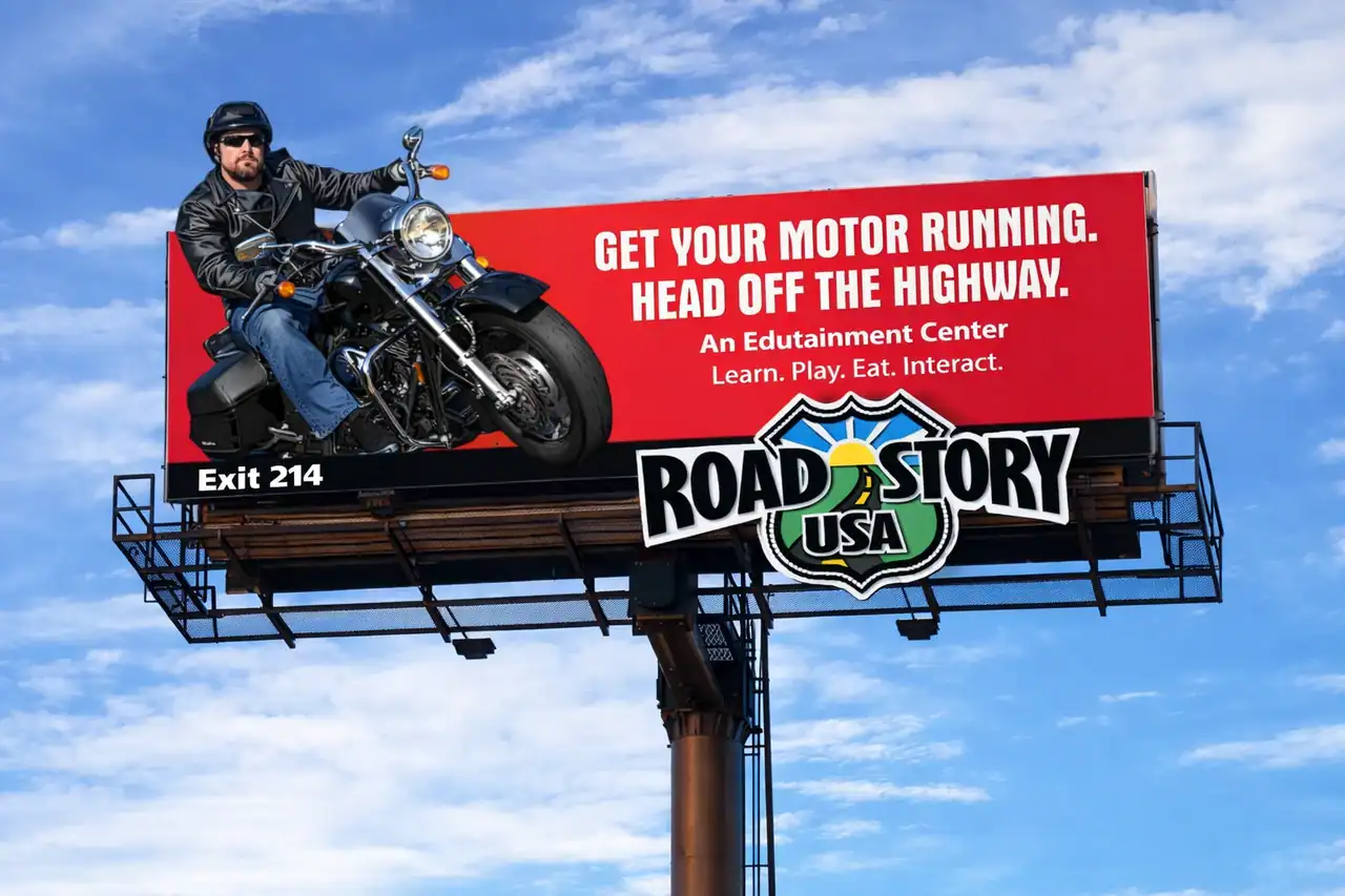
Concept B asks its copy to do several jobs. “Get Your Motor Running” supplies personality. “Head Off the Highway” asks for action. “An Edutainment Center” names a category, and “Learn. Play. Eat. Interact.” lists activities. Cutting all the smaller copy would remove the destination explanation along with the extra instruction. Exit 214 also needs a location check: being visible in this mockup does not establish roadside readability.
My proposed first experiment is to remove the highway invitation while retaining the destination explanation, brand, and Exit 214. Compare that version with the original. Then test whether people understand “edutainment center”; if they do not, revise the description rather than delete the only category cue. Change one element at a time so the response tells you what to reconsider.
That is a proposed experiment, not a claim that either historical concept outperformed the other. Glen Rose and Roadstory pose complementary questions: what essential meaning is missing, and what competing instruction can be removed?
Creative Options Marketing’s Roadside Decision Check uses one principle: different failure modes need different evidence. Viewer answers reveal what the message communicates. Unit specifications reveal whether the file fits the booked display. Neither can answer the other question, so Steps 2 and 3 stay separate until the decision in Step 4.
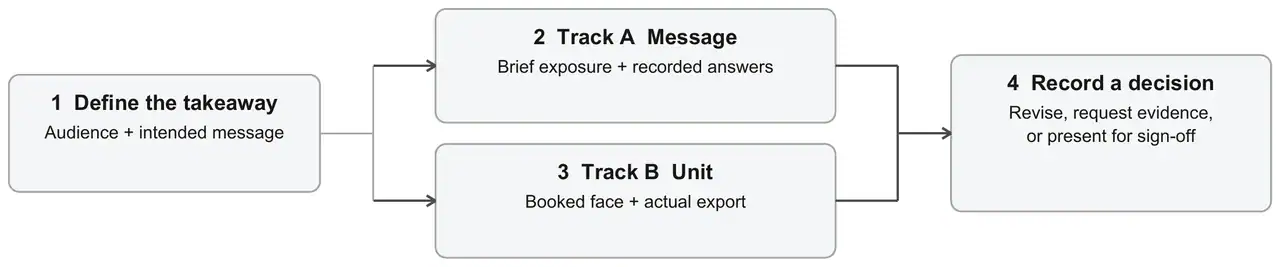
Step 1: Write the intended takeaway. Write the audience, objective, advertiser, and intended takeaway before showing the artwork. Include the service or destination cue when that is the objective. Otherwise, it is too easy to count whatever viewers happen to remember as success.
Step 2: Check message comprehension, Track A. For an informal first screen, show the artwork for about four seconds to three people unfamiliar with it. Remove it and record their answers to: What is being advertised? Who is it from? What should you remember? Ask about an action only when the objective requires one. Four seconds is a practical starting screen informed by Lamar's viewing guidance, not a validated research threshold or a representative audience study.
For this proposed screen, advance only when all three identify the advertiser and the intended takeaway without hints. If any answer misses either, revise and repeat with new viewers. This is a conservative workflow rule, not a statistical pass mark.
Step 3: Check the booked unit, Track B. Collect the unit ID, direction of travel, approach image, dimensions, safe area, bleed, operator requirements, usage rights, and final proof. Compare those requirements with the actual export. Missing specifications remain missing even when everyone likes the design.
Step 4: Record the next decision. Use the evidence from both tracks rather than one overall impression.
| What you find | Next decision |
|---|---|
| The intended message is misunderstood | Revise the message or hierarchy, then repeat Track A |
| The production file conflicts with the unit requirements | Correct the file and repeat Track B |
| Viewer answers or unit evidence are missing | Request that evidence; do not infer a pass |
| All three identify the advertiser and intended takeaway without hints, and unit checks are complete | Present the artwork for advertiser and operator sign-off |
Three people can expose an obvious misunderstanding; they cannot establish population-level recall or sales impact. A revision also requires fresh viewers and more review time. For higher-stakes decisions, scope audience research accordingly. Glen Rose demonstrates a creative revision and two delivered formats; this newly described protocol was not applied retrospectively.
Confirm the available face before treating its creative specifications as settled. Renting space on an existing sign and authorizing a new structure are different tasks.
CDOT's outdoor-advertising guidance covers signs along the state highway system, including signs within 660 feet of highway right-of-way. Its currently linked permit application identifies the sign owner, operator, and property owner separately. The form carries a January 2020 revision date; confirm the current form with CDOT before filing. Do not infer the division of responsibilities in your media contract from the creative approval alone.
Denver's billboard guidance restricts new billboards to specified zoning areas and requires removal credits to prevent a net increase. Billboard zoning permits are renewed annually. These conditions affect which faces are available. They do not replace the operator’s creative specifications.
Before ordering, ask for the face ID, travel direction, approach photos, posting dates, accepted creative categories, current specifications, and confirmation that the inventory is available for the proposed campaign. Collecting those details adds work before booking but can prevent a late redesign when the actual face differs from the brief. For a new structure, get project-specific permitting advice from the responsible parties.
Use the unresolved decision to choose the work. An unclear offer needs message development. An approved message going onto another face needs a production adaptation first. Buying a new concept for that second job can add cost and reopen decisions already settled.
For Glen Rose, naming MRI was message work; preparing the two face shapes was layout work. Use that distinction in the quote: separate concept and message development, additional formats, and media rental plus printing or posting.
Specify concepts, review rounds, and final deliverables. For a campaign with unresolved message or placement questions, ask Creative Options to scope its creative services around the Roadside Decision Check, alongside advertising planning.
OAAA and Lamar recommend seven or fewer as a benchmark. Before cutting, label each line’s job: identify the advertiser, explain the offer, or give a destination cue. If two lines do the same job, consider removing one. Preserve words that supply meaning the image cannot carry.
Specify letter height in inches on the actual production layout. Ask the designer to mark the headline and supporting-copy heights for each booked face, then review them against the approach view and operator’s specifications. A software point size alone does not settle approval for different billboard formats.
Do not make scanning the required action for moving drivers. Write down what viewers should remember without scanning: the advertiser, service, or destination cue. For a pedestrian-friendly placement, consider a QR code only after checking where people could safely stop and what the linked page asks them to do.
This guide does not publish Creative Options project prices. For comparable quotes, give each supplier the same scope: a new message or approved artwork, the number of formats, review rounds, and final files. Ask what a further revision or additional size would add. List media rental, printing, and posting separately.
Separate delivery from response. Verify which board ran and when, then assess relevant inquiries, searches, visits, or redemptions against a baseline and other marketing activity. The OAAA 2020 measurement guide distinguishes delivery measurement and attribution approaches. It is used here for that distinction, not current platform capabilities. A design review does not establish campaign return.
The idea can carry across formats; the export needs checking. Static production may require bleed and print specifications. Digital requires the exact pixel dimensions, permitted motion, duration, and delivery format. OUTFRONT's specification resource directs advertisers to inventory-specific requirements. Two printed boards can also need different layouts, as Glen Rose's 2:1 and 3:1 finals show.
Good billboard design needs a clear takeaway and a file that fits its destination. Bring your goal and audience, the proposed artwork, and the unit details to the review. If the face is not selected, identify what remains unknown. Message development can proceed; production approval stays provisional until the actual unit is checked.
Contact Creative Options Marketing to scope a Roadside Decision Check for your campaign. We can identify the creative questions, the operator information still needed, and the revisions to resolve before production.