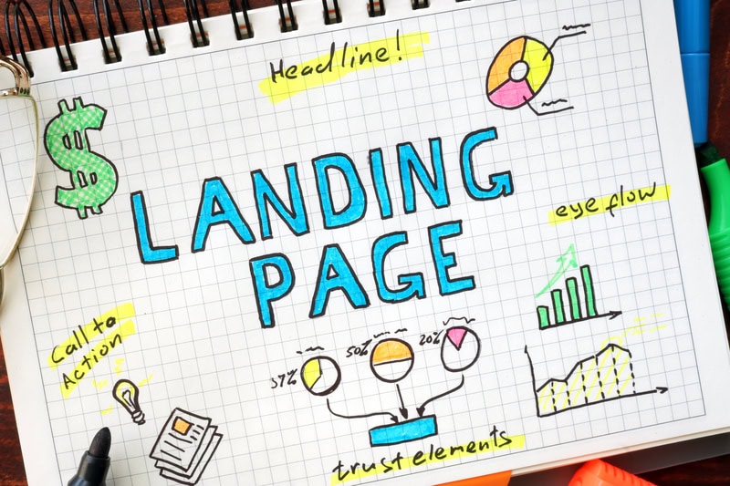
Website design for conversions is the difference between a site that generates leads and one that just looks good. Your website gets traffic. But if that traffic isn't turning into phone calls, form submissions, or sales, you have an expensive digital brochure, not a business tool.
We've been auditing websites for Denver businesses since 2009, and the pattern is consistent. Most sites that underperform on conversions don't have a design problem in the traditional sense. The colors are fine. The logo looks sharp. The problem is that nobody thought about getting more leads from existing traffic when the site was built.
This guide covers the design changes that actually improve website conversions, ranked by impact. If you want website conversion tips you can act on this week, start with the first three sections. They account for the biggest conversion lifts we see across our client work.
- Your value proposition above the fold matters more for conversions than page speed, color scheme, or layout combined.
- CTA placement is not optional. Every page needs a clear next step visible without scrolling.
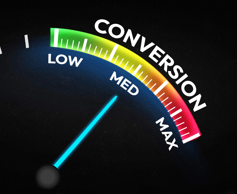
- Website conversion rates average 2-3% across industries (Ruler Analytics, 2025). Small design changes can push you above that threshold and generate significant revenue gains.
- Mobile design is a conversion factor and a ranking factor. Desktop converts at roughly 3.9% while mobile converts at 1.8% (Retail Touchpoints).
- Trust signals like testimonials, case studies, and client logos reduce friction at the decision point, where most sites lose visitors.
01 - MessagingWhat Design Change Has the Biggest Impact on Conversions?
Clear messaging above the fold. Not speed. Not color. Not animations. Messaging.
This is the contrarian take, but the data backs it up. We've seen sites with 4-second load times outconvert sites at 1.5 seconds because the slower site had a clear value proposition and the faster site buried its message below three stock photos and a slider.
When someone lands on your homepage, they make a judgment in the first 5-8 seconds. They're answering one question: "Is this for me?" If your above-the-fold content doesn't answer that question, they leave. It doesn't matter how fast the page loaded.
Here's what belongs above the fold on every page:
- A headline that says what you do and who you do it for
- A subheadline that states the primary benefit
- One CTA that tells the visitor what to do next
- Proof (a client count, a review rating, or a credential)
A Cherry Creek retail client came to us with a site that loaded in under 2 seconds, scored 94 on PageSpeed Insights, and converted at 0.8%. The problem was immediately obvious: their homepage opened with a full-width video of their storefront with no text overlay. Visitors had no idea what the store sold until they scrolled. We added a clear headline, a benefit statement, and a "Shop Now" CTA above the fold. Conversions jumped to 2.4% within 60 days. No speed optimization. No redesign. Just messaging.
This is the conversion web design principle most agencies get backwards. They start with aesthetics. Start with clarity instead.
02 - Calls to ActionHow Do CTAs Affect Your Website Conversion Rate?
Directly. A page without a clear CTA is a page that asks the visitor to figure out what to do next. Most won't.
Your CTA should be above the fold on every page. Period. This isn't a suggestion. Speed matters, but it's not the whole story. A Portent study analyzing over 100 million pageviews found that sites loading in 1 second had conversion rates 3x higher than sites loading in 5 seconds. But CTA clarity and placement often decide what happens after the page loads.
Here's what separates CTAs that convert from CTAs that sit there:
Specific language beats generic language. "Get Your Free Site Review" outperforms "Contact Us" because it tells the visitor exactly what they'll receive. "Learn More" is the weakest CTA on the internet. Tell people what they're learning about.
Make the CTA visually obvious. Your CTA button should be the most prominent element on the page. If it matches the color scheme, it disappears. Test a bold color against your background and measure the difference.
Frequency matters. One CTA per page is not enough for content longer than 500 words. Place a CTA above the fold, one at roughly 40% through the page, and one at the bottom. Each can use slightly different language pointing to the same action.
Placement follows proof. Your mid-page CTA should come after the reader has seen evidence of your expertise, not before. Lead with value, then ask. This is where website design for conversions separates from generic web design: every element has a job, and the CTA is the closer.
03 - Page SpeedDoes Page Speed Really Affect Conversions?
Yes, but probably not the way you've heard it repeated.
The stat every marketing blog cites ("a 1-second delay causes a 7% drop in conversions") comes from a 2017 Akamai report, and it's been recycled without context ever since. The more useful data comes from a 2022 Portent study that analyzed real conversion data across 20 B2B and B2C websites: sites loading in 1 second converted at 3.05%, dropping to 1.08% at 5 seconds. That's a 3x difference, not a 7% one.
A Deloitte study found that even a 0.1-second improvement in load time increased conversions by 8% for retail sites and boosted customer spending by 10%. And Vodafone's 2021 A/B test showed that a 31% improvement in their Largest Contentful Paint (LCP) score led to 8% more sales.
The takeaway: speed matters, but it compounds with other design factors. A fast site with unclear messaging will still underperform a slightly slower site with strong CTAs and a clear value proposition.
Here's what to prioritize for speed:
- Compress images to WebP format before uploading
- Reduce third-party scripts (analytics, chat widgets, social embeds)
- Use a CDN if you're serving visitors across multiple regions
- Test your Core Web Vitals with Google's PageSpeed Insights and fix LCP issues first
For our Colorado clients, we typically see the biggest speed gains from image compression and removing unused plugins. Those two fixes alone account for 60-70% of the improvement in most WordPress audits. When you're thinking about website design for conversions, speed is one of the fastest wins available. If you're looking for small SEO changes that work, start here.
04 - Mobile DesignHow Does Mobile Design Impact Conversion Rates?
Mobile accounts for over 60% of all website traffic, but desktop still converts at roughly double the rate. Retail Touchpoints data shows desktop converting at 3.9% versus 1.8% on mobile. That gap represents lost revenue for every business that treats mobile as an afterthought.
Google's mobile-first indexing means your mobile site is what gets evaluated for search rankings. But beyond SEO, the conversion gap between mobile and desktop comes down to three design issues:
Tap targets are too small. Google recommends buttons and links be at least 48x48 pixels. If your visitors have to pinch-zoom to tap your CTA, you're losing conversions. Test your site on an actual phone, not a responsive preview in your browser.
Forms are too long. A desktop form with 7 fields is manageable. On mobile, it's a wall. Cut your mobile forms to the absolute minimum, and name, email, and one qualifying question is usually enough.
Content is hidden behind hamburger menus. Mobile navigation is harder than desktop navigation. If your most important pages are buried two taps deep, mobile visitors won't find them. Keep your primary CTA visible at all times, even on mobile. A sticky header with a "Call Now" or "Get a Quote" button works well for service businesses.
In Denver, we routinely see mobile-first behavior on local service sites. If your mobile experience drags, you lose the fastest-moving leads. Any serious approach to website design for conversions has to start with how the site performs on a phone.
05 - Trust SignalsDo Trust Signals Actually Increase Website Conversions?
They do, and the effect is measurable.
Trust signals include client testimonials, case studies, review ratings, client logos, industry certifications, and security badges. Their job is to answer the unspoken question every visitor has: "Can I trust this business?"
Here's where trust signals make the biggest difference: at the decision point. A visitor who reads your service description, understands your pricing, and is ready to fill out your contact form will hesitate if there's no evidence that other people have worked with you and had a good outcome. That hesitation is where conversions die.
What works:
- Specific testimonials with names and companies. "Great service!" from "J.S." does nothing. "They increased our leads by 40% in 90 days" from "Sarah Mitchell, Marketing Director at XYZ Corp" is proof.
- Case studies with real numbers. Before/after data, timelines, and specific outcomes. Even a brief one-paragraph case study on your homepage is better than none.
- Review counts and ratings. "4.8 stars from 127 Google reviews" is a trust signal that works because it's verifiable.
- Client logos. If you've worked with recognizable brands, show them. A row of 5-6 logos above the fold signals credibility instantly.
One objection we hear regularly: "My website already looks professional. Do I really need testimonials cluttering it up?" Yes. A clean, professional-looking site with no social proof is like a well-dressed salesperson who won't give you references. It looks good, but it doesn't close. Good website design for conversions means design and proof working together. Don't sacrifice one for the other.
06 - SEO + DesignWhat Role Does SEO-Friendly Website Design Play in Conversions?
SEO and conversion are not separate disciplines. An SEO-friendly website design brings the right visitors to your site. Conversion-focused design turns them into leads. When both work together, you get compounding results.
Here's where the overlap matters most:
Site structure affects both rankings and user behavior. A clear navigation with logical categories helps search engines understand your content AND helps visitors find what they need. If your site is structured around how your customers think (not how your org chart looks), you'll rank better and convert more.
Internal linking keeps visitors moving. Links between related pages reduce bounce rates and give visitors a clear path from awareness to action. If someone reads a blog post about your services, a contextual link to your SEO, PPC, and content marketing page keeps them moving toward a decision. SEO services for Denver businesses can help you build this structure properly.
Schema markup helps search engines display your content in rich results. FAQ schema, review schema, and local business schema all improve click-through rates from search results. Better CTR means more qualified traffic, which improves your conversion rate without changing anything on the page itself. This is SEO website design working at the technical level, connecting how your site is built with how it performs in search.
Page titles and meta descriptions are your first CTA. Before someone even reaches your site, they see your title tag and meta description in search results. A title that clearly states what the page offers and who it's for will attract visitors who are more likely to convert, instead of anyone who clicks.
When someone clicks through from your Google Business Profile, the page they land on is your conversion moment. If that page matches what they expected to find, based on your GBP listing, your reviews, and your search snippet, they'll convert. If it doesn't, they're gone in seconds. That's website design for conversions at the most practical level: making sure every entry point delivers on its promise.
07 - FAQFrequently Asked Questions
Website conversion happens when a visitor takes a desired action: filling out a form, making a phone call, completing a purchase, or downloading a resource. You measure it by dividing total conversions by total visitors and multiplying by 100. If 30 out of 1,000 visitors submit your contact form, your conversion rate is 3%. Google Analytics 4 tracks conversions as events that you define based on your business goals.
A high converting website is designed around the visitor's decision process, not around what looks impressive. It has a clear value proposition above the fold, specific CTAs on every page, trust signals near decision points, fast load times, and a logical path from landing to action. The difference isn't usually dramatic visually. It's structural and strategic.
The average website converts 2-3% of visitors (Ruler Analytics, 2025). Design changes to messaging, CTA placement, speed, and trust signals can push that number significantly higher. A Deloitte study found that even a 0.1-second improvement in load time increased retail conversions by 8%. Moving a CTA above the fold or adding a testimonial can produce similar or larger gains with less technical work.
The biggest mistakes are unclear messaging above the fold, missing or weak CTAs, slow load times (especially on mobile), no trust signals or social proof, and forcing desktop navigation patterns onto mobile users. Most of these are fixable without a full redesign. You can run a conversion rate audit to identify which of these issues are costing you the most leads.
UX design improves conversions by reducing friction. That means fewer clicks to reach important pages, forms that are easy to complete on any device, visual hierarchy that guides the eye to CTAs, and page layouts that match how visitors actually scan content (left to right, top to bottom, F-pattern). Every reduction in friction is a potential increase in conversions.
In most cases, optimize first. A full redesign is expensive, time-consuming, and risky because you lose existing SEO equity if URLs change without proper redirects. Targeted optimizations, like rewriting above-the-fold messaging, adding CTAs, compressing images, and adding trust signals, can produce measurable conversion improvements in weeks, not months. Redesign when the site's technical foundation or architecture is fundamentally broken, not because it looks dated.
Most design changes show measurable results within 30-60 days, assuming your site gets enough traffic to produce statistically meaningful data. Simple changes like CTA adjustments or adding trust signals can show results faster. Speed optimizations show up almost immediately in bounce rate data. For a complete website conversion rate optimization project, expect 60-90 days for the full impact to become clear.
Ready to Improve Your Website Conversions?
Your website might look great. But if it's not converting visitors into leads, design isn't doing its job. Get a free conversion review of your homepage. We'll look at your messaging, CTA placement, mobile experience, and trust signals, then tell you the three changes that would produce the biggest lift.
Request Your Free Conversion ReviewNo pitch, just a clear assessment based on 15+ years of Denver marketing services experience.
David Drewitz is the founder of Creative Options Marketing, a Denver-based agency that has been helping Colorado businesses improve their marketing since 2009. He specializes in data-driven SEO, conversion optimization, and digital marketing strategy for small to mid-size businesses. Connect on LinkedIn