Denver, Colorado – Every business wants to increase sales. And every business wants to be more efficient in using the marketing budget. Having a landing page is one step in achieving that. The number of visitors to your landing page who end up taking the action you want them to take (shop, create an account, ask for a bid, etc.) divided by the total number who visit is your conversion rate. The higher your conversion rate, the higher your return on investment. Here are some tips to maximize the effectiveness of your landing page through “conversion-centered design:”
Framing
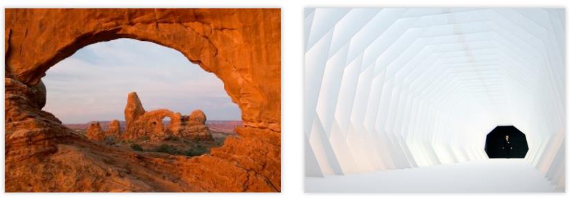
A frame works like a spotlight, drawing the viewer’s attention in and centering it on your message. For maximum conversion, your message should be your conversion goal, presented as a call to action. Like looking through a telescope, framing isolates and magnifies your message, and ensures that it enters your viewer’s mind uncluttered.
Color
A warm color from the red end of the color spectrum appears closer than a cool color from the blue end of the spectrum. So objects and letters in warm colors will stand out from a cool-colored background in an almost-3D effect. Color also induces emotions. We tend to like colors we associate with things we like and vice versa. So the emotions a color elicits will vary from individual to individual, but here are some general guidelines:
Blue – peace and rest, a sense of order, logic and rational thinking.
Red – love, passion, ferocity, boldness
Green – balance, peace, rest, hope, comfort.
Orange–energy, celebration, abundance, comfort
Pink – Pink softness, sweetness, innocence, youthfulness, tenderness
Yellow –cheerfulness, curiosity, flexibility, learning
Purple – contemplation, mystery, dignity
Brown – practical, reliable, sensible, wholesome
Black – timeless style, elegance, deep thought
White – simplicity, purity and cleanliness, perfect balance, harmony
Gold – cheerfulness, abundance, wisdom, deep understanding
Silver – prestige, dignity, practicality
Eye Direction
Use visual cues (arrows, pointers, pathways, forced perspectives, etc.) to direct your viewer’s eyes to specific points on the page.
Eye Contact
Human attention is drawn to the eyes of others. We want to see what they see; we look where they look. Let a pair of eyes, human or non-human, look intently at something and your viewer will look at it too.
Beauties and Babies
Babies will spend more time looking at pictures of symmetrical faces than non-symmetrical faces. We are hard-wired to look at attractive faces. And when we look at the faces of babies, we generate brain chemicals that make us feel good. Using attractive people and babies on your site ensures your viewers will give them their attention.
Open Space
Nothing makes words and images stand out like nothing. Place words and images in an empty visual field to make them stand out as the center of attention.
Consider the Negative
Studies have shown that we are more motivated to avoid a negative than to achieve a positive. “Stop throwing money away!” is a more motivating message than “Save money today!”
Do It Now!
Urgency is a call to action in itself. Statements of urgency (“A limited time offer!”
“Buy now.” etc.) prod your viewer to make a purchase decision right away. This can be a very effective technique, especially when paired with the concept of limited availability.
Sampling
Just as letting customers sample new food products produces more sales for grocery stores, letting your viewers preview what you have to offer through a sneak peak, a download, a blog post or a reward for registration will increase your sales.
Social Stats
Nothing establishes credibility like the testimony of others. We tend to like what others like. Posting statistics on the actions of others (social media sharing, webinar registrants, number of downloads, etc.) may be just what you need to motivate conversion.To learn more about how to beat the average and use design to help increase your landing page conversion rates, contact us today


